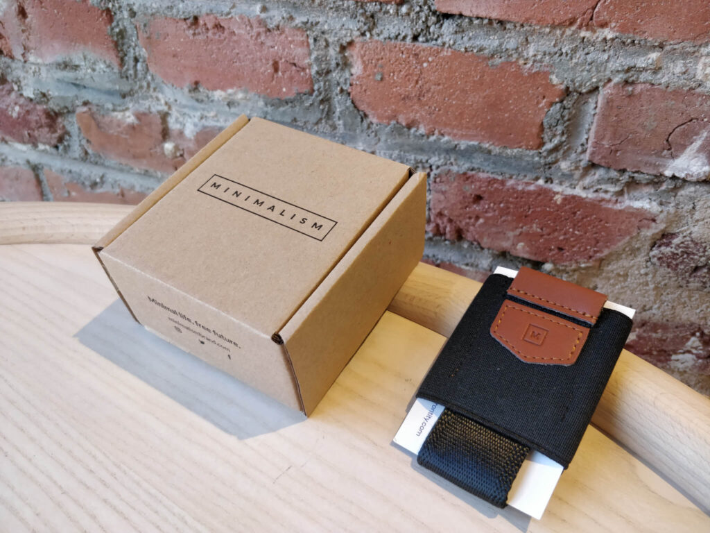
We’re starting to see minimalism, and minimal packaging taking the world by storm.
When you look at the different packaging trends that have been seen throughout the last few years, we’ve seen creativity, new orientations, and a push for technological advancements and materials.
Then of course, we need to look at simplicity and being minimal, as this is something that’s changed the way the product works, and offers some informative, unique looks to the packaging offered.
The common factor of this is that they are minimal and simple. Simple is the primary principal that’s being used to create an impactful, while also being a memorable sort of packaging design.
Food for instance is starting to get the minimalist treatment, especially in our pastas. These days, it’s simple, and one food brand is taking it in a way where there are only two major elements that are worth looking at. The first are the eggs in the lower right part of this, and the pasta that you can see through the windows that are placed near the center, large enough to make the products really shine, speaking for themselves.
Then, let’s look at the soups. A lot of soups that are famous abroad are starting to take advantage of this. the soup is right there in the center, showing off a beautiful soup that looks super tasty. The background of course uses an anonymous, gray undertone, and is something that really just showcases the soup. We don’t need anything else, and the packaging is right there, served to your own personal needs.
Superfoods, such as Primal Joy, are also taking advantage of this. This is a protein granola, which has a simple two-color packaging with a bold black font for the product name and the company. It’s simple, but still offers a bold nature to these illustrations that are stylized and offer a transparent type of window. There’s no sort of artifice or anything hiding the product. What you get from this is what you’re going to get.
There are some who are looking to offer a more radical and daring sort of minimalism. There is a mint chocolate bar that consists of just having a bold and stylized leaf that sits in the center, and the sleeve tops and bottoms being a minty green color. This is super simple, but these elements are practically right there, looking at you. The product itself sells by hinting that it doesn’t need the extra container and other additives. Even the typeface that’s used is very marginal, and it outlines the perimeter used in this wrapping, and it’s something that’s unique, and something that we really do love, especially through this example, and the unique tones of this.

Finally, let’s also look at other products too. There are tea bags that are actually looking to go minimal and spend less time highlighting something extravagant. Gable bag boxes are the way to go with this, and the way that it’s sold is the colors. They’re bright, adding a pop art flare to them, and without any graphics, a very minimalistic logo, and even typography that doesn’t really try to be too extra, it’s one that shows both the essentialness of this, while also offering \a balance that’s stylistic.

It’s unique, and with a lot of different products, you can go minimal with the packaging without being super bland and boring. These are but a few of the many examples that are out there and offer a unique sort of spin on the packaging that’s out there providing you with a fun, unique means to really highlight the products that you offer.